Super Teacher is the first AI tutor for kids and elementary schools.
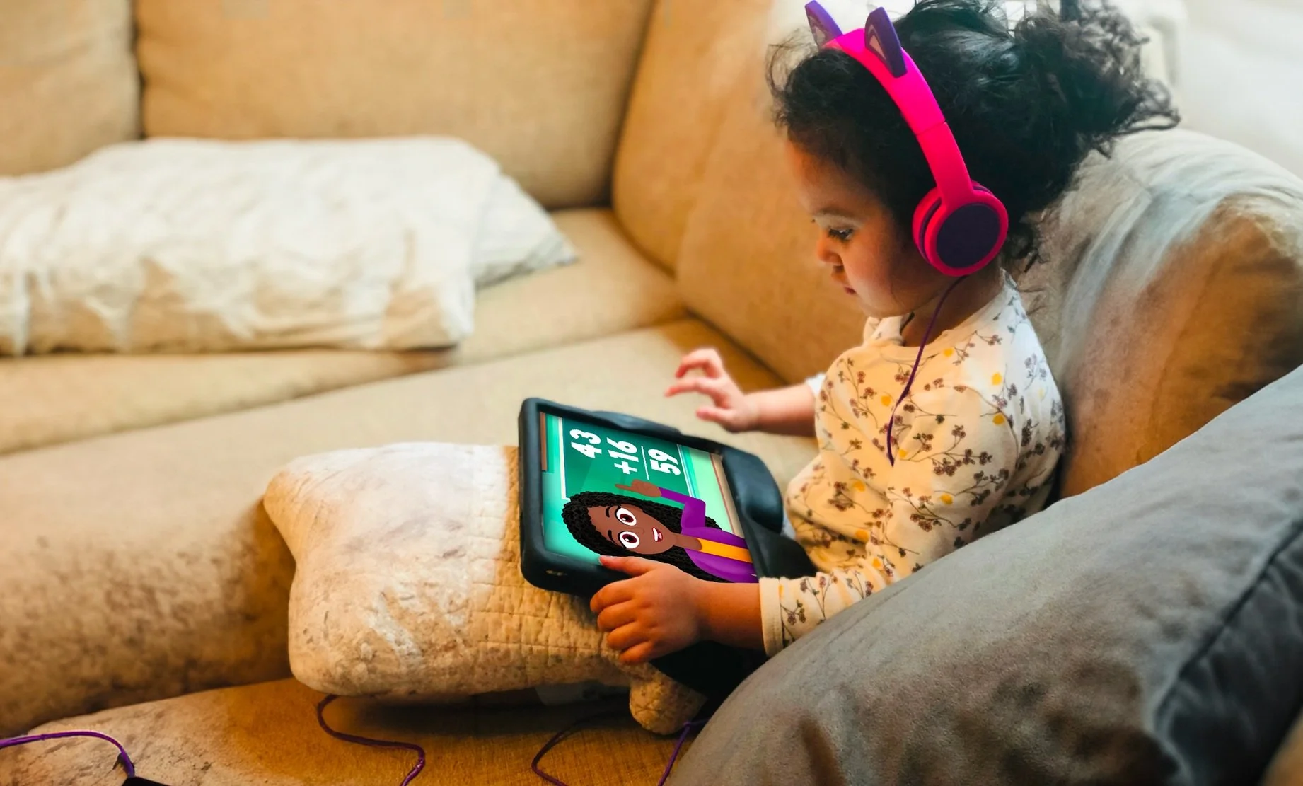
Since launching in 2022, Super Teacher is now used in homes by tens of thousands of families, and in schools by teachers across the country. Lessons are conversational, so kids naturally learn by speaking out loud and being responded to by an animated character. Unlike other AI educational platforms, it is completely safe for kids and never goes off the rails: all the content is created by real teachers, and the animated tutor redirects off-topic conversation to keep lessons on track.
As the Head of Product Design at this AI-powered ed-tech startup, I’ve been involved every step of the way: leading UX/UI design for the mobile app, web app, and lesson creation platform; animating motion graphics and assets; writing lessons myself; creating marketing materials; and much more.
UX/Product Design case study: App navigation
One of our challenges is serving the needs of our many users: students from 3-year old toddlers to 10-year old elementary school students, parents, teachers, principals, homeschoolers, and more. As one example, here’s a walkthrough of how navigation of our content library has evolved over time.

Goal: Make it easier for users to find content that’s right for them
Measurable impact:
Users spend less time exploring the app and more time taking lessons.
Users find the appropriate content, measured by an increase in retention during lessons, repeat play-throughs of lessons, and users continuing on to the next lesson in the same course.
No negative impact on some users while benefiting others: Making things easier for a 3-year-old shouldn’t make it harder for an adult, and vice versa.

Strategy: Balance easy navigation for kids and detailed info for parents
Whenever I animate something, storyboarding is my favorite part of the process. And similarly, my favorite part of UX is storyboarding, wireframing, and sketching out brainstormed explorations. Years of doodling in school comes in handy!
We explored different balances of art-heavy navigation for kids, with text-heavy navigation for parents to understand the educational content of each course. For filtering by age and subject, we tried out more in-your-face versions to make clear the breadth of our offerings, with subtler versions that looked nice but were less discoverable. We also considered an AI-forward version where you could have a conversation about what content you were looking for. We did consider different views for Student and Parent profiles, but decided that the engineering cost of maintaining two separate layouts across multiple devices would be too high. So we decided to make one layout for everybody.
Eventually, we settled on a version with always-displayed filters for extra discoverability, thumbnail-focused “featured samplers” for kids, and detailed course folders for parents. This would carry through on each page of the course-to-lesson flow, with big art-heavy CTAs for kids, and easily ignorable text for parents wishing to know more.
To get the app in front of real users for actual feedback as soon as possible, we planned to iterate and add new elements of the navigation as the app continued to evolve.

Early days: A buffet of educational content
Super Teacher is primarily structured around individual lessons grouped into courses. When the app first launched, it had only a few dozen lessons, in courses scattered across a range of ages and subjects. Navigation in the app was a basic list of courses which worked like folders of lessons, followed by individual lessons that didn’t belong to a course.
We intentionally didn’t include filtering or searching because a user might choose some combination which didn’t match up to any of the content created so far. By treating the app more like a buffet with all of our options visible at once, it would seem more robust, and a user would be encouraged to browse and explore all our different options as opposed to hunting for one particular piece of content they had in mind.

Filtering by age and subject
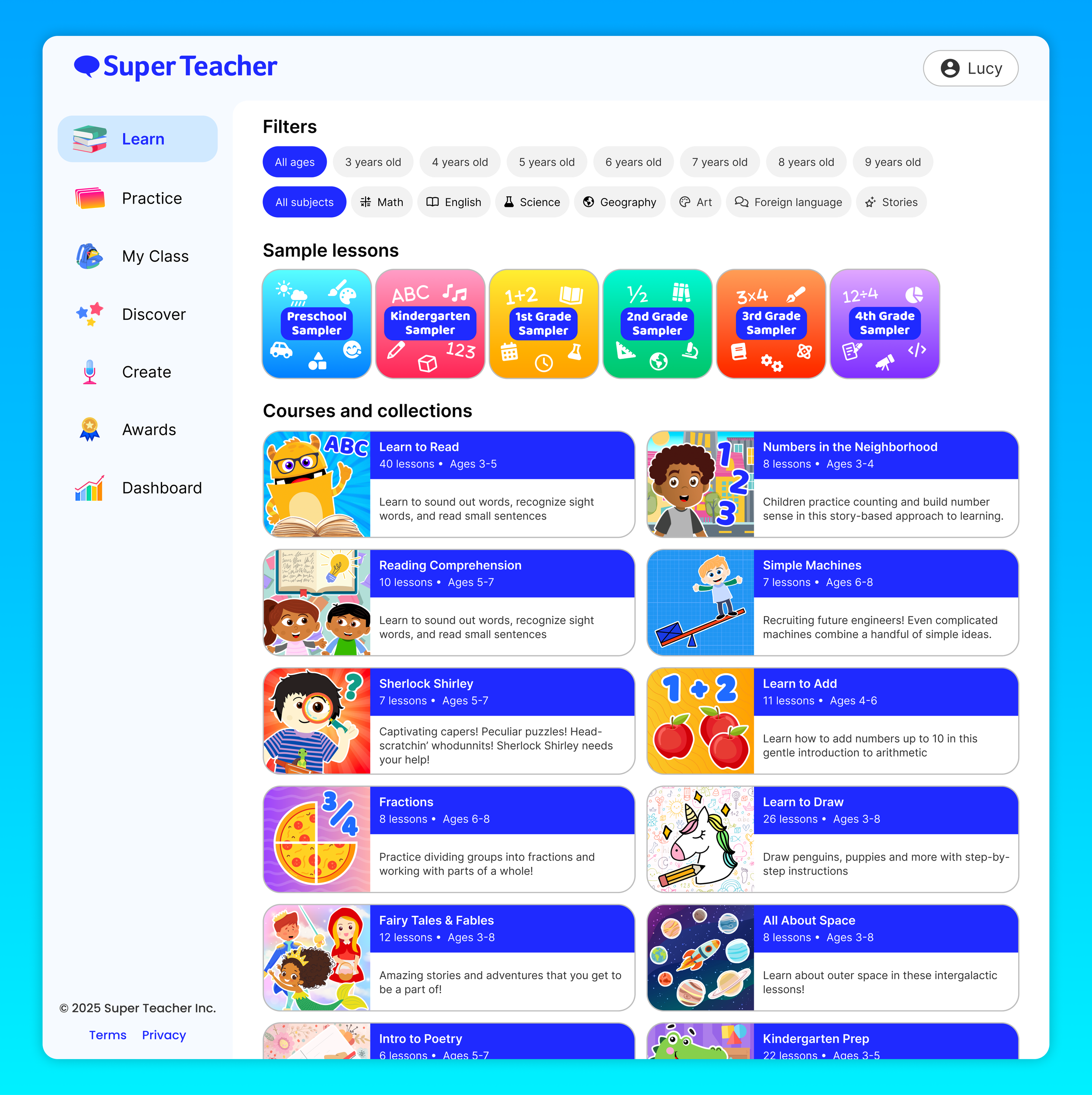
The number one factor that determines whether a students finds a lesson engaging is whether they’re in the target age range: students taking a lesson aimed above them get confused, and students taking a lesson aimed below them get bored. Once we had a fuller library of content, our next priority was to help users find content which hits the age sweet spot. We introduced Lesson Samplers that highlight curated lessons for each grade level, appearing at the top of the app and drawing a parent’s attention: this let us handpick some of our favorite lessons, and nudge users towards an ideal first experience without forcing it and frustrating them.
We also added filters for age and subject, appearing as dropdown menus to avoid cluttering the screen further, and still encouraging users to try the Lesson Samplers first before filtering. With subject filters, we decided to keep them reasonably broad (like “English” instead of “Spelling,” “Reading,” “Stories,” etc), so a user wouldn’t be overwhelmed by choices. Filters also had the side benefit of revealing what additional content users want: when a substantial number of users are filtering for Math and Age 8, that tells us we should be adding more math content for older kids. Finally, for the full list of courses, we still chose not to sort them by age when unfiltered. This was because we don’t know the age of a user when they open the app, and we wouldn’t want older kids (and their parents) to be discouraged by opening the app and seeing the screen filled with toddler content. When filters are set, the list is sorted, but by default it gets across the breadth of our content, primarily for parents.

Hierarchy and calls to action
Over time, the app became robust with thousands of lessons across dozens of courses, and we divided the app into tabs named after verbs, like Learn, Practice, Discover, and Create. The Learn tab is the new name for our full library of content, and we continued making changes to create a better hierarchy of elements, particularly for new users: our goal was to showcase how the depth and breadth of our content, without being overwhelming.
We did focus testing and observed parents and teachers using the app, and discovered that many users were missing the dropdown filters at the top of the screen. To increase discoverability, we changed the filters to show all their options in rows, changed “featured lessons” to “sample lessons” so that it’s clearer that they’re showcasing specific lessons instead of housing every appropriate lesson for that age, and refreshed the app’s branding to a bolder blue which also differentiated between courses and lessons. For children, we added more iconography and clearer thumbnails for users who can’t read.
Testing the improvements
In addition to usage analytics, we tested the improvements through focus groups, and got feedback from parents who said they liked the more modern blue colors (which felt slicker than the green palette which felt educational in an old-fashioned way). We learned from focus testing and device analytics that teachers primarily use the app on laptops in their classrooms, so we began devoting extra time to the web version of the app. This led to reorganizing the layout into tabs on a side bar, since we could take advantage of the increased screen real estate.
Other metrics which measured the success of these changes:
Engaging thumbnails led to more click-through-rate for starting lessons, and higher completion rates (average of 15% up to 35%) proved that users were finding the right lessons, meaning that our filters and better use of hierarchy was working
Higher follow-through rates of users completing all the lessons in a Sampler and then taking other lessons in the app, meaning we solved the problem of users thinking that Samplers contained all the content in the app
Lots of use of the filters, which also led to other actionable insights (a surprising amount of searching for Math and 8+, which led us to create more higher level math content)

The future and beyond
Of course we’re just getting started, and there are so many more ways to continue improving the app so students, parents, and teachers can have the best possible experience. A few things I’ve explored:
A search bar for finding specific keywords, which would also let us use “suggested searches” or “other users are search for” to highlight specific content we want to bring attention to
Separate modes for different users: a Kids Mode with more graphics and less text (plus other gamification elements), a Parents Mode (more text explaining the educational value of content and analytics for showing a child’s progress), and a Teacher Mode (more tools for assigning lessons, assessing students’ skills, etc)
A fully conversational home screen which mimics the lessons themselves: speak to the teacher and tell her what you want to learn, and she’ll help you find it!